How to Easily Make a Line Chart in Excel with RunCell
If you want a quick first draft in RunCell, start with a prompt like this:
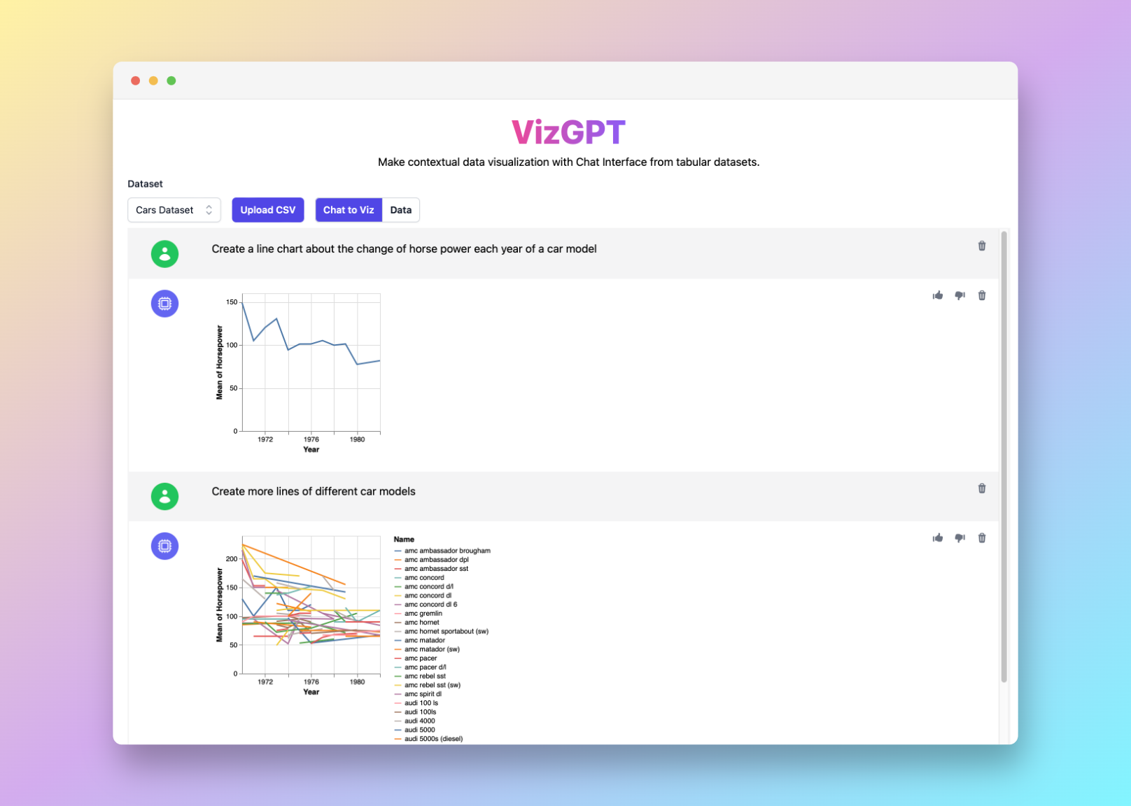
Create a Line Chart from the data set
You can draft the line chart in RunCell first, then download it and bring it into Excel.
If you want to start from your own CSV instead of the sample data, use RunCell first and export the chart once it looks right.
Introduction
Microsoft Excel is well known for turning raw data into clear visualizations, and line charts are one of its most useful formats. This guide walks through the Excel steps and shows where RunCell fits if you want to draft or iterate on the chart in Jupyter first.
How to Make a Line Chart in Excel with RunCell
RunCell is an easy-to-use notebook tool that brings chart generation, code execution, and iteration into one Jupyter workflow.
Here are the steps to use RunCell:
- Upload CSV to RunCell.
- Use a prompt to create a line chart.
Prompt: Create a Line Chart from (Variables of your selection).
- Press the Visualize button.
- Download the Chart and import to Excel.
If you want to keep refining the chart before exporting it, continue working in RunCell (opens in a new tab).
How to Make a Line Chart in Excel: A Detailed Guide
Gathering and Organizing Your Data
When preparing to create a line chart in Excel, it's important to start with a clear understanding of the data you have and how it should be organized. This process involves gathering the data points that will form the basis of your chart.
This information could come from various sources. It might be sales figures from your company's internal reporting system, web analytics data, survey results, or any other form of structured data. You should ensure that your data is accurate and up-to-date to create a meaningful chart.
Once your data is gathered, it's time to input it into Excel. Organizing your data within Excel is a critical step towards creating a line chart. Your data should be input in rows or columns, with each cell containing a data point.
For instance, if you're looking to track sales over a certain period, you might have dates running down one column and corresponding sales figures in the next column. Each row would represent a different date, and each column would represent a different data category.
Creating the Line Chart
The next step is to create the line chart itself. This involves highlighting the data you want to include in the chart and then using Excel's inbuilt chart creation tools.
To do this, you should:
-
Select the cells that contain the data you want to chart. This might be a single range of cells containing both your x and y data, or two separate ranges if your data is not adjacent in your spreadsheet.
-
Once your data is selected, navigate to the 'Insert' tab in the Excel toolbar.
-
From there, you'll select 'Line Chart' from the 'Charts' group.
-
A drop-down menu will appear, showing you a variety of line chart styles to choose from. These include simple line charts, stacked line charts, and line charts with or without markers. The best style will depend on your data and how you want to visualize it. Select the one that best suits your needs.
Your chart should now appear in your spreadsheet, with Excel automatically assigning data to each axis.
Customizing the Line Chart
Once your line chart is created, Excel offers a range of customization options to enhance the clarity and visual appeal of your chart.
Here are a few ways you can customize your chart:
-
Modify the chart title: By default, Excel will create a generic chart title. To make your chart more informative, you should change this to something more descriptive of your data.
-
Modify the axis titles: Just like the chart title, you can and should modify the axis titles to reflect the data they're representing.
-
Change the line style: Excel allows you to modify the style of the line in your chart. You can change its color, thickness, and whether it has any markers.
-
Add data labels: Data labels can be added to provide additional information or context for the data points in your chart.
-
Adjust the axis scale: If your chart is not displaying your data in a clear way, you might need to adjust the scale of your chart's axes.
Remember, the main aim of these customizations is to ensure your line chart communicates the desired information effectively and accurately.
By following these steps, you'll be able to create clear, impactful line charts in Excel. However, if you're looking for a more intuitive and less manual process, consider using tools like RunCell to help you visualize your data.
Frequently Asked Questions
1. Why should I use a line chart?
Line charts are especially effective in displaying trends over time. They allow viewers to easily see increases or decreases and understand the overall pattern of the data.
2. Can I use RunCell for creating other types of charts?
Yes, RunCell can be used to create various types of charts such as bar charts, pie charts, and scatter plots, among others.
3. What are some alternatives to Excel for creating line charts?
Aside from Excel, other tools like Google Sheets, Tableau, and RunCell can also be used to create line charts.
Conclusion
In conclusion, whether you choose to use traditional tools like Excel or innovative ones like RunCell, the ability to effectively communicate data through visualizations is a powerful skill that can significantly impact your business decisions and strategies.